Texas A&M PVFA Website Redesign
Texas A&M recently created a new school - the School of Performance, Visualization and Fine Arts (PVFA) - which aims to provide a new emphasis on the intersection of arts and technology at the university. The current website is not intuitive or user-friendly, making it difficult for current and prospective students of the school to find information quickly.
To address this, I worked in a group of four Visualization students to conduct a redesign of the website. Our goal was to simplify and optimize the website’s navigation.
SOFTWARE USED: Figma
Before
After
Navigation Structure
The old website had a hidden navigation bar inside a hamburger menu, even on desktop. The primary concern was that users couldn't view all their options at once, leading to a cumbersome and less intuitive browsing experience. Important sections of the site were obscured, making it difficult for users to quickly locate the information they needed.
We revamped the navigation into a more user-friendly, two-tier system:
Top Tier: Main Categories: Now, main categories like About, Admissions, and Academics are always visible at the top.
Second Tier: Subcategories: When you click a main category, relevant subcategories appear underneath. For instance, clicking "Academics" might show links to departments and course catalogs.
This makes it easy for users to find what they need without extra clicks or searching.
Before
After
Directory
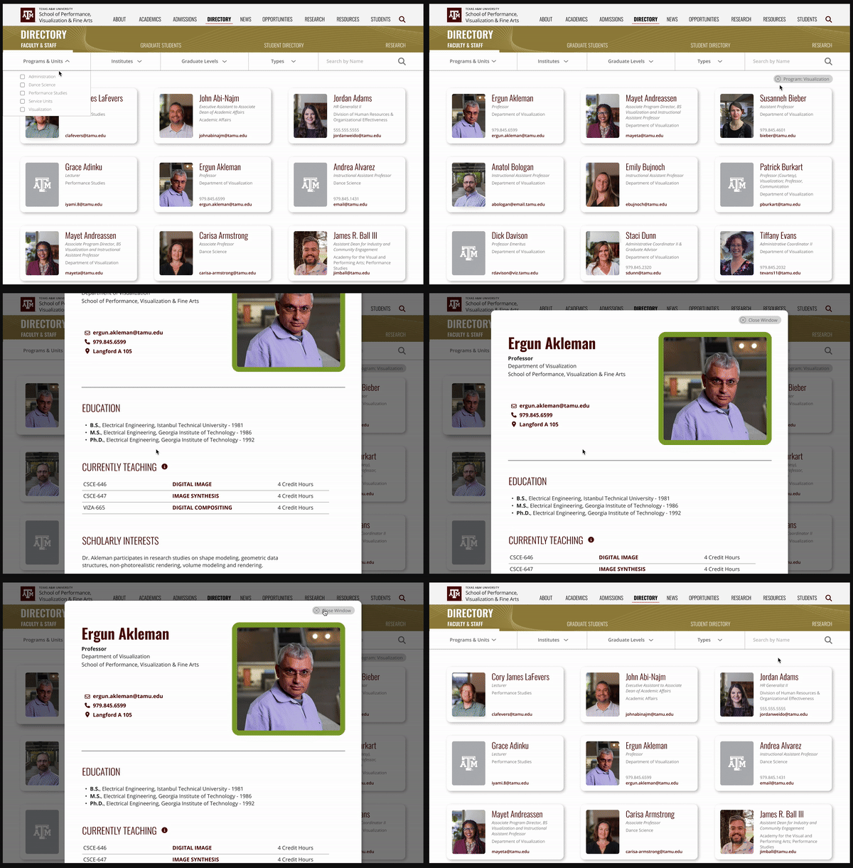
One of my key responsibilities was redesigning the directory page to improve the filter functionality. The previous design had several issues, particularly with the filters, which were hidden and difficult to use. Users couldn't easily see or manage their selections, leading to a frustrating experience.
I focused on two improvements:
Ease of Access: Users can now quickly access and apply filters without unnecessary clicks or navigation.
Intuitive Use: The clear display of selected filters helps users manage their search criteria more effectively, leading to a smoother and more intuitive browsing experience.
News Page
I also led the redesign of the news page. Similar to the directory, filtering and organization was a large focus for me here as well.
The combination of filters and search functionality makes the news page highly navigable. Users can easily refine their search results based on their preferences, ensuring a more tailored and efficient browsing experience. This user-centric approach helps in increasing the time users spend on the site and improves their overall satisfaction.


